


Overview
The self-branding project, "Open Bookmarks Co.". I am embodying branding process through this project. I logically created naming, typography, color, and logo mark. No exaggeration and decoration. A little added my admire and ideal. I tried to find myself and keep consistency.

Naming
After I organized myself, I enumerated the name of design agencies. Then, I searched the meaning why they named. Many creatures use just their name. Because they are well-known in advertising/design industry. Advertising magazine features their stunning work a lot. Hence, that's great for SEO.
On the other hand, many creators have own story in a company name. I felt sympathy for it. Especially, I followed Kashiwa Sato's approach. His creative agency, SAMURAI, named by his name, 士=Samurai. However, I didn't use the same idea directly. Why am I creating business identities for a client? Because I would like to contribute to increasing client's follower. Favorites are called bookmarks. I found an answer.
On the other hand, many creators have own story in a company name. I felt sympathy for it. Especially, I followed Kashiwa Sato's approach. His creative agency, SAMURAI, named by his name, 士=Samurai. However, I didn't use the same idea directly. Why am I creating business identities for a client? Because I would like to contribute to increasing client's follower. Favorites are called bookmarks. I found an answer.

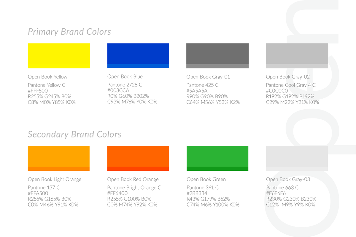
Color
Yellow is the most luminous of all the colors of the spectrum. It is very effective for attracting attention, so use it to highlight the most important elements of design. The meaning is the color of sunshine. It is color theory and associated with joy, happiness, intellect, and energy. Yellow presents one of my characters.
Typography
At first, I look for what I would like to tell a customer. What I want a customer to feel when they see the typeface? "Sophisticated, earnest and diligent." In this case, I have to choose serif.
According to Wikipedia, Baskerville's typeface was part of an ambitious project to create books of the greatest possible quality. Baskerville was a wealthy industrialist, who had started his career as a writing-master (teacher of calligraphy) and carver of gravestones, before making a fortune as a manufacturer of varnished lacquer goods. At a time when books in England were generally printed to a low standard using typefaces of conservative design, Baskerville sought to offer books created to higher-quality methods of printing than any before, using carefully made, level presses, a high quality of ink and very smooth paper pressed after printing to a glazed, gleaming finish.
Baskerville expresses my voice tone. I adjusted the typography slightly to my feeling.

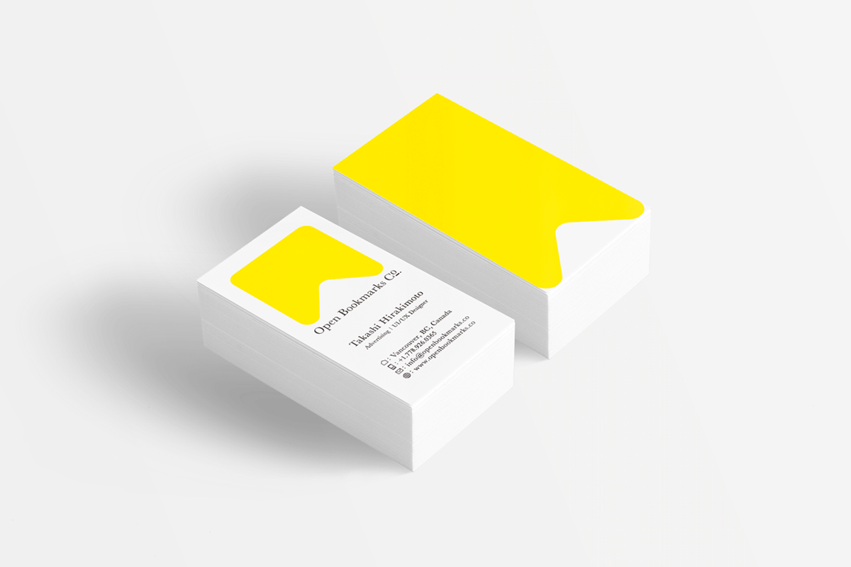
Logo
People have an image of "Bookmark". It really cherishes as a design component. In case, I confirmed it before designing. Google shows common images based on people's search. I collected them. Then, I mixed it with my idea.
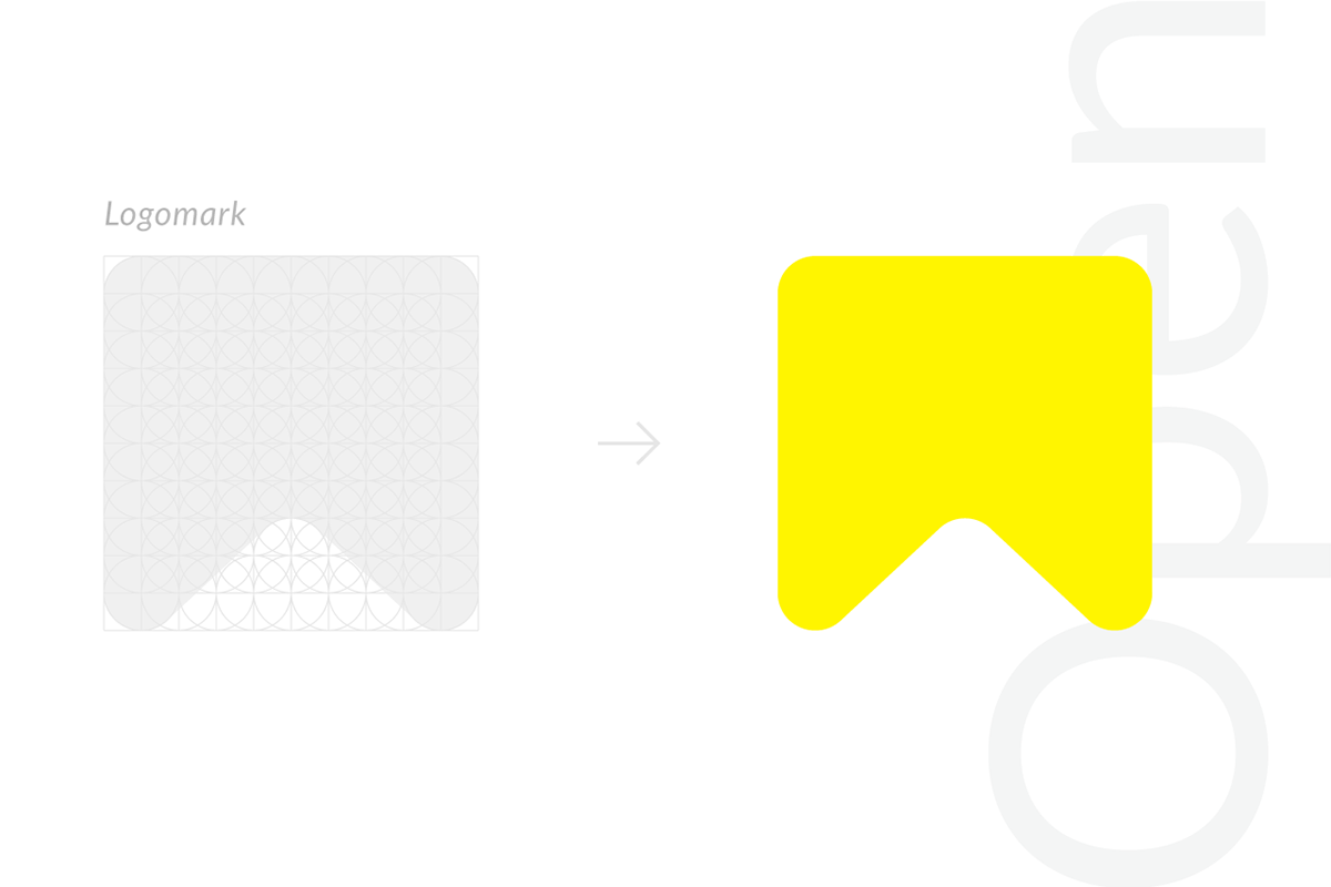
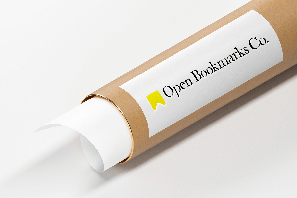
Open Book Marks Co.

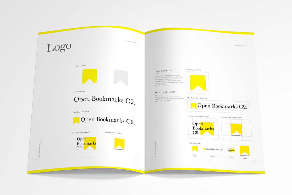
Style Guide
The process is not finished yet even you created brand identity. You(or client) have to utilize it properly. The style guide shows a background of creative direction, appropriate margins, background, color, size and so on. I provide a style guide after the workshop(discovery brand attribute and core value). The style guide is an asset of the company.


Graphic Design


Iconography

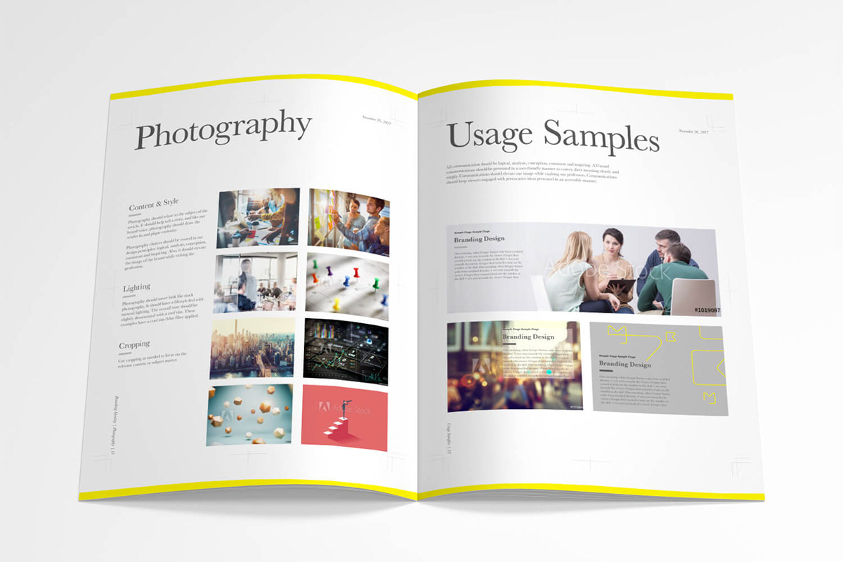
Photography


Web Design
I created the previous portfolio in 2012. I wrote a code, HTML, CSS, Javascript at that time. I used Masonry.js, and I still like it. Now I think, I won’t have a chance to create a website that way. Because I learned WordPress and this is much easier than Bootstrap. In addition, a client can manage WordPress more comfortably.
I used Keynote for slylescapes and Sketch APP for wireframe. I, of course, create more precisely, insert images and fill in the brank with a right copy for client's work. The result is what you see at "https://www.openbookmarks.co".


Facebook

Overall
I have started this project in 2016. Since then, I knocked over 5 different printing company. I worked with 5 different photographers. After all, I cannot work alone. I need corporation and collaboration of local people. It's challenging, that's why meaningful.
😄 Takashi Hirakimoto @ Open Bookmarks Co.
✉️ https://www.linkedin.com/in/takashihirakimoto
✉️ https://www.linkedin.com/in/takashihirakimoto
✍️ Branding, Web Design & UX Design
📙 Building trust through design
👍🏻 Meeting people beyond nationality
📍 Vancouver, British Columbia, Canada
📋 https://bit.ly/396j9Jx
📙 Building trust through design
👍🏻 Meeting people beyond nationality
📍 Vancouver, British Columbia, Canada
📋 https://bit.ly/396j9Jx


